Cost Explorer
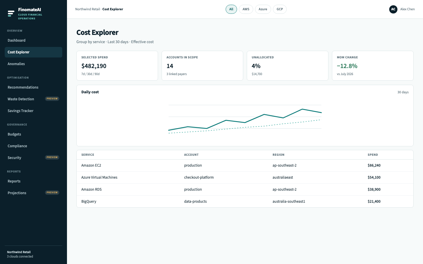
Cost Explorer is the analysis surface. Use it when a Dashboard total needs an explanation.
CloudHealth splits this work across Cost History, InterActive Reports and FlexReports. FinomateAI puts the ad-hoc slice on this page: pick a range, group the bill, filter, then drill. Named, reusable slices are Saved views.
Before you begin
- Know which provider bill you will compare against.
- Prefer a completed month for the first reconciliation.
Open a useful view
- Open Cost Explorer.
- Select the provider chip, or leave All.
- Set the date range to 7d, 30d or 90d.
- Read Selected spend and Accounts in scope.
- Scan the daily chart for a material step-change.
- Use the table to see service, account and region together.
What the columns mean
| Column | Use |
|---|---|
| Service | Provider service name (for example Amazon EC2, Azure Virtual Machines, BigQuery) |
| Account | Linked account, subscription or project label in the cost model |
| Region | Where the usage was billed |
| Spend | Amount for the selected range and cost type |
Drill further
When one row dominates:
- Note service, account and region.
- Follow Drill-down to resource-level evidence.
- If the movement is unexpected, open Investigate a cost spike rather than guessing.
Typical questions
| Question | How to answer it here |
|---|---|
| What drove this month versus last? | 30d vs previous completed month; group by service |
| Which account owns the EC2 bill? | Filter service = Amazon EC2; group by account |
| Is this a region concentration? | Group by region, then drill |
| Can finance replay this next week? | Export, or wait for saved views |
Expected result
You can name the services and accounts that explain the Dashboard total for the selected range.